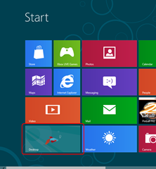
This blog post is intended to express my initial impressions of the Windows 8 Consumer Preview.
- Move your mouse cursor to the bottom right corner over the magnifying glass
- Wait for the menu to appear.
- Click on "Settings"
- Click on "Power"
- Click on "Shut down"
- Right click on the start button
- "Shut down or sign out"
- Click "Shutdown"
Initial Impression
I know, sounds silly right? I had to Google "How to shut down Windows 8". Well that was my first experience with Windows 8.The first impression I got from this whole metro experience?
"The fuck is this shit?"
Microsoft seems to have a bit of difficulty understanding that you can't shoehorn a desktop OS into a tablet. But that's ok, they've shoehorned a tablet OS into a desktop.
The touch-screen oriented user interface is now perfect for my keyboard and mouse. Making me scroll from left to right with the mouse to search for apps organised in a seemingly random order is extremely easy, that's why majority of the websites scroll horizontally!
For those who didn't spot it, that previous paragraph was intended to be extremely sarcastic.

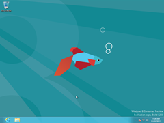
After the initial metro culture shock, I looked around for an out. I wanted the desktop. Glad to see they didn't destroy that yet.

So the desktop looks just like Windows 7, without the start menu. Sure, that's fine. I think I can do without that...
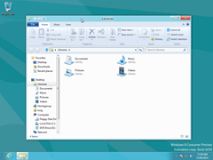
But my heart sunk even lower after clicking on Windows Explorer.

Lo and behold, ribbons. Yep, transformation complete. Those "love it or hate it" ribbons from Office 2007 have been ported into the Windows 8 Windows Explorer. This sealed the deal, I am not upgrading to this cursed odd cycle OS.
Hybrid user interface
So far, I don't think this OS should be shipped. Why? Plainly because it's a filthy mongrel.The user interface (outside of metro) is not geared for touch-interface users. The icons and buttons are too small for fingers so it's too easy to click the wrong screen elements.
However, for keyboard and mouse users, the whole touch-centric interface is nothing short of frustrating. You can't swipe or pinch, so you're forced to work with the mouse in an unnatural way.
I'm no fan of Apple products but at least they got something clear from the get-go. Keep the touch and desktop operating systems as separate software entities!
Shutting down...
I'll play around a bit more with Win8 later. But because I installed this at 5am in the morning, I needed to find the shutdown button. Wait, what shutdown button!?
Clicking on the magnifying glass on the bottom right corner gave me an overview of all the app icons. Too small to be legible, too empty to be useful.
I clicked randomly to zoom back in. I took a second look through all the apps to find something that may lead to a shutdown. Nothing.
After moving my mouse cursor back to the magnifying glass I realised it was a futile attempt to click it again in hope something different would happen, so I stopped to think.
And that's when it happened. Rather than displaying a tooltip of what the magnifying glass is supposed to do, a menu appeared!
But what's this? Settings? Sure it's 5am, I don't mind browsing through some settings quickly.
So after clicking on Settings I had to click into "Settings" again. Somebody at Microsoft had just discovered memes and this was their sick interpretation of an Easter egg... There were only two options, just enough for the pluralisation of "Settings" to be valid.

So I tried again and found the "More PC Settings" label below.
Sadly, I completely missed the part which says "Power" above it. Partly because I was looking for "settings" (I mean, why else would I be there right?) and also due to the fact that ALL THE ICONS ARE WHITE.
After years of using Windows you've come to learn that power or shutdown buttons are red, easy to spot out in a big sea of icons. Hipster Microsoft said, "Fuck that! With our Metro styling everything will look the same."

After messing with all the options, something dawned upon me...

There's no way out. No "Back", "Apply" or "OK" buttons of sorts. FUCK Ballmer, what is this half baked shit? What happened to eating your own dog food?
After minutes of frustration (in computing time it feels like hours) trying all possible menus and the escape button, my last resort was to press the Windows button.
Sweet mother of God, it worked. I was thrown back to the shitty Metro home screen.
I clicked on the "Settings" button again, but thought "Do I really wanna go there again?". And that's when I noticed the subtle "Power" icon.

Screw this, I'm outta here.
Microsoft, you've really dropped the ball here. Your competitors are gaining ground, what you gonna do?- You're losing desktop systems to Mac OSX
- Windows 7 phones is barely picking up traction
- You're losing browser turf to Chrome and Firefox
- And Nintendo is still decimating the gaming market


