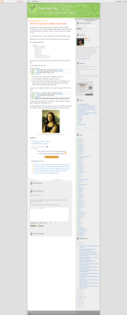
The good old "classic" layout from blogger.com has certainly served me well since my first post on the 25th of June, 2008. Over the past 5 years, I eventually wanted more space for content as my posts and code snippets became lengthier.
After searching around for a nice free theme, I stumbled upon Ultra Theme from bloggerthemes.net. Applying a few tweaks and updates of my own to the theme, I finally think it's ready!
The main changes are:
- Obviously the colour has changed
- Wider body column
- Wider right column
- Updated blocks on RHS column
- Moved donation blurb to RHS column & semi-fixed it
- Ads actually fit in the given space now
- H4 headings are now actually different to "bolded" text
- Cleaned up some markup so it's quicker to load
I'll probably make more tweaks as I go along, but for now you can compare them side by side below.
ps. LOL wow, still works on IE6 (mostly)


